Lab 1 - Data visualization
This lab is due Wednesday, September 13 at 11:59pm ET.
Learning goals
In this lab, you will…
- learn how to effectively visualize numeric and categorical data.
- continue developing a workflow for reproducible data analysis.
Getting started
Go to the sta199-f23-2 organization on GitHub. Click on the repo with the prefix lab-01. It contains the starter documents you need to complete the lab.
-
Clone the repo and start a new project in RStudio. Reminder instructions for doing so are given here:
Click on the green CODE button, select Use SSH (this might already be selected by default, and if it is, you’ll see the text Clone with SSH). Click on the clipboard icon to copy the repo URL.
In RStudio, go to File ➛ New Project ➛Version Control ➛ Git.
Copy and paste the URL of your assignment repo into the dialog box Repository URL. Again, please make sure to have SSH highlighted under Clone when you copy the address.
Click Create Project, and the files from your GitHub repo will be displayed in the Files pane in RStudio.
Click lab-1.qmd to open the template Quarto file. This is where you will write up your code and narrative for the lab.
Packages
We will use the tidyverse package to create and customize plots in R.
Data: Let’s take a trip to the Midwest
The data in this lab is in the midwest data frame. It is part of the ggplot2 R package, so the midwest data set is automatically loaded when you load the tidyverse package.
The data contains demographic characteristics of counties in the Midwest region of the United States.
Because the data set is part of the ggplot2 package, you can read documentation for the data set, including variable definitions by typing ?midwest in the console.
Exercises
As we’ve discussed in lecture, your plots should include an informative title, axes should be labeled, and careful consideration should be given to aesthetic choices. Your narrative should be written in complete sentences.
In addition, the code should not exceed 80 characters on a given line, so that all the code can be read when you render to PDF. To help with this, you can add a vertical line at 80 characters by clicking “Tools” \(\rightarrow\) “Global Options” \(\rightarrow\) “Code” \(\rightarrow\) “Display”, then set “Margin Column” to 80, and click “Apply”.
Remember that continuing to develop a sound workflow for reproducible data analysis is important as you complete the lab and other assignments in this course. There will be periodic reminders in this assignment to remind you to render, commit, and push your changes to GitHub. You should have at least 3 commits with meaningful commit messages by the end of the assignment.
- Make a histogram to visualize the percentage college educated (
percollege) of counties. Set the binwidth to 2 and include axes labels and a title.- Describe the shape of the distribution.
- Do there appear to be any outliers? Briefly explain.
For more details and code examples for histograms, check out the ggplot2 reference page.
- Create a scatterplot of the percentage of people with a college degree (
percollege) versus percentage below poverty (percbelowpoverty) with points colored bystate. Label the axes and give the plot a title. Make sure the legend is also informative and has clearly labeled groups. Use thescale_color_viridis_d()function as an additional layer to apply the viridis color palette to your plot.
See Introduction to the viridis color maps to read more about the viridis R package and see code examples.
Render, commit, and push your changes to GitHub with the commit message “Added answer for Ex 1 -2”.
Make sure to commit and push all changed files so that your Git pane is empty afterwards.
Describe what you observe in the plot from the previous exercise. In your description, include similarities and differences in the patterns across states.
Now, let’s examine the relationship between the same two variables, using a separate plot for each state. Label the axes and give the plot a title. Use
geom_smoothwith the argumentse = FALSEto add a smooth curve fit to the data. Which plot do you prefer - this plot or the plot in Ex 2? Briefly explain your choice.
se = FALSE removes the confidence bands around the line. These bands show the uncertainty around the smooth curve. We’ll discuss uncertainty around estimates later in the course and bring these bands back then.
Now is another good time to render, commit, and push your changes to GitHub with a meaningful commit message.
Once again, make sure to commit and push all changed files so that your Git pane is empty afterwards.
-
Do some states have counties that tend to be geographically larger than others? To explore this question, create side-by-side boxplots of area (
area) of a county based on state (state).- Describe what you observe from the plot.
- Which state has the single largest county? How do you know based on the plot?
-
Do some states have a higher percentage of their counties located in a metropolitan area? Create a segmented bar chart with one bar per state and the fill determined by the distribution of
metro, whether a county is considered in a metro area. The y axis of the segmented barplot should range from 0 to 1.- Describe what you observe from the plot.
For more details and code examples on different types of segmented bar charts, see this useful resource from r-graph-gallery.
For this exercise, you should begin with the data wrangling code below. We will learn more about data wrangling next week.
Now is another good time to render, commit, and push your changes to GitHub with a meaningful commit message.
And once again, make sure to commit and push all changed files so that your Git pane is empty afterwards. We keep repeating this because it’s important, and because we see students forget to do this. So take a moment to make sure you’re following along with the instructions around Git.
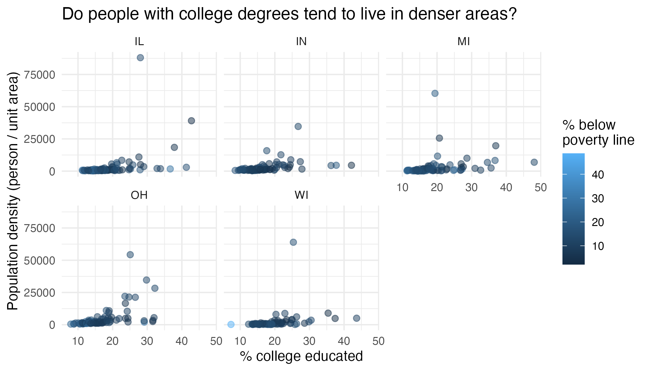
- Recreate the plot below.
Hints:
-
The
ggplot2reference for themes is helpful in determining the themes. For this plot, usetheme_minimal. - The
sizeof the points is 2. - The transparency (
alpha) of the points is 0.5. - You can put line breaks in labels with
\n. - The width and height of the plot are 7 and 4.5.

Render, commit, and push your final changes to GitHub with a meaningful commit message.
Make sure to commit and push all changed files so that your Git pane is empty afterwards.
Submission
Once you are finished with the lab, you will submit your final PDF document to Gradescope.
Before you wrap up the assignment, make sure all documents are updated on your GitHub repo. Your final PDF and QMD files should be pushed to the GitHub repo and the Git panel should be empty. We will be checking these to make sure you have been practicing how to commit and push changes.
You must turn in a PDF file to the Gradescope page by the submission deadline to be considered “on time”.
To submit your assignment:
- Go to http://www.gradescope.com and click Log in in the top right corner.
- Click School Credentials \(\rightarrow\) Duke NetID and log in using your NetID credentials.
- Click on your STA 199 course.
- Click on the assignment, and you’ll be prompted to submit it. You should only be submitting the PDF file here.
- Mark all the pages associated with exercise. All the pages of your lab should be associated with at least one question (i.e., should be “checked”).
- Do not select any pages of your .pdf submission to be associated with the “Workflow & formatting” question.
Grading (50 pts)
| Component | Points |
|---|---|
| Ex 1 | 5 |
| Ex 2 | 6 |
| Ex 3 | 4 |
| Ex 4 | 8 |
| Ex 5 | 6 |
| Ex 6 | 7 |
| Ex 7 | 8 |
| Workflow & formatting | 6 |
The “Workflow & formatting” grade is to assess the reproducible workflow. This includes: - Update your name and the date in the YAML - Commit the final version of your lab to Github. - Label your code chunks. - Have readable code that does not exceed 80 characters on a given line, i.e., we can read all your code in the rendered PDF. - Pipes %>%, |> and ggplot layers + should be followed by a new line, and the same pipe style should be used through out the lab (either %>% or |>.)
